Email Design Trends to Give Your B2B Marketing a Boost
B2B brands need to up the ante and think more creatively about their email marketing strategies. Ensuring your content is delivered to the right people is only half the battle. You also need to focus on how your emails look.
Good design plays a vital role in making connections, generating trust and keeping subscribers engaged with your email campaigns. In addition to providing good content, you also need to keep up with visual trends.
We all know that packaging sells and that everyone does, in fact, judge a book by its cover. Readers want quality information, but they also want it to be delivered in a visually pleasing way. And with all the email design tools available to B2B marketers these days, there’s no reason why you can’t deliver.
Your design choices need to be driven by two things:
What is right and consistent for your brand.
What is most likely to connect with your target audience.
To establish an emotional connection and earn a click-through, you must have a deep understanding of your customers' needs, their habits, and their content preferences. This means connecting data-driven marketing with creative execution. And, as the tastes and preferences of subscribers evolve, your email design should too.
So, let’s dig into some of the most current trends and design best practices for email.
Personalisation
Personalisation requires work, but it’s well worth the effort. According to the Fall 2020 State of Email report by Litmus, personalised emails generates a median ROI of 122%.
Regarding design, creating a personalised email experience goes beyond using someone’s name in the subject line. Rather, your design should centre around your client’s tastes. For instance, do they respond better to a more serious, professional mien, or do they appreciate a bit of whimsy to help liven up their day?
The visuals, layout, and language you use in your email design should reflect these preferences. Fortunately, with marketing automation and dynamic content tools, this level of email personalisation is easy to achieve at scale.
Representation
Not a trend so much as a long overdue shift in consciousness. To be able to connect with your business, potential clients need to be able to see themselves represented by you. Representation has to go deeper than a mere review of your marketing imagery, however if all of your images are of middle-aged white men in grey suits and skinny, laughing blonde women, it’s not a bad place to make a start.
Ask for Customer Feedback
Personalisation can’t depend solely on quantitative data gathered with tracking and analytics (such as open rates). You also need direct feedback from readers. For instance, you can ask readers to simply click on a checkmark if they found your email useful. Or respond to a quick question at the end of the message.
Regardless of how you choose to gather feedback, tie it into the overall email design and user experience. Where providing feedback is nearly effortless and feels like the natural last step when someone reads your message.
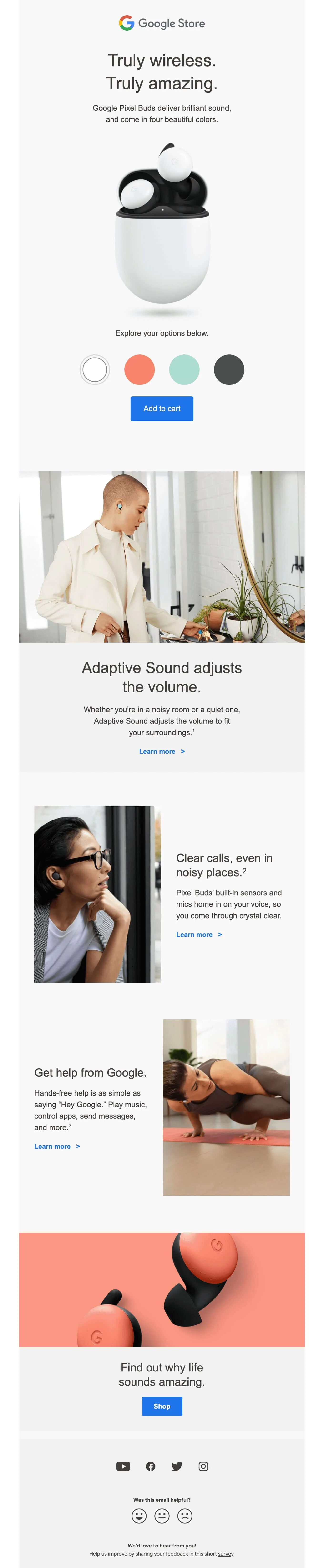
Example image source: Google @ reallygoodemails.com
Integrate Sharing
Instead of adding social sharing buttons at the end of your message, you can make individual sections shareable throughout your email. For example, an important quote or valuable statistic that you want more people to know about. Also, animate social media icons to make them more noticeable and encourage your readers to follow your profiles. Integrating opportunities to share will help engage readers and further increase your brand reach in their social networks.

Example image: the Daily Skimm
Interactive Email
Thanks to new technology, using dynamic, interactive elements in messages is an emerging trend in 2021. There are many ways to make your emails more interactive. For example, you can use sliders, playful quizzes, search bars, and image carousels. Interactive design elements present a great opportunity to make your email both more engaging and more functional.
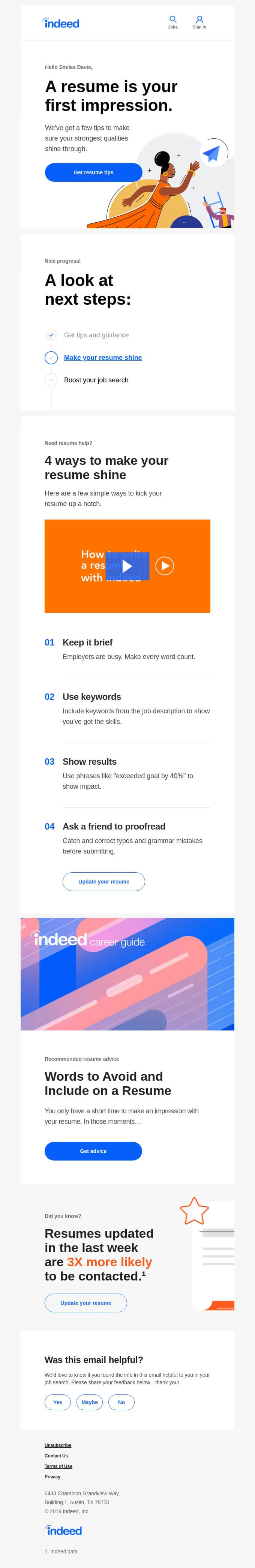
Example image source: Indeed @ reallygoodemails.com
The Long Read
Borrowing from content marketing, people are exploring a long read approach toward email marketing. The goal is to deliver exclusive thought leadership pieces to the people who are most engaged and interested in what you have to say. Excellent user experience is key when designing long-form content. You must ensure information is well-organised and that content is properly formatted using a mobile-first approach.

Example image source: Jorge Arango @ reallygoodemails.com
Editorial Design
Another design approach gaining popularity is making your emails feel luxurious, like a chic and stylish magazine. Your email engages readers not only for the information it contains but also because it appeals to their sense of aesthetic. Clean and simple layouts work really well here — lots of white space, high quality, on-brand images, bold typography. Broken grids are another option, as they can create an artistic sense of asymmetry to further heighten visual interest.

Example image source: https://reallygoodemails.com/emails/engineered-for-exploration
Landing Pages
Each year email newsletter designs look more and more like traditional landing pages. In this approach, your email design is populated with widgets and other sorts of content blocks. For instance, a hero area, promo blocks, the main content area, and a footer. The various modules co-exist together to create a cohesive user experience. Often landing page emails use tightly written, focused copy, but it’s also possible to meld this format with a long read approach.
Content Curation
Are your team always turning up interesting and high-quality links? Are they on the cutting edge of industry news? If so, use other people's content creation position you as an expert in your industry as you focus on content curation.
Use your deep understanding of your industry to filter out the best content and information for your readers. In addition to sharing interesting links, create additional value for your readers by including your own commentary and insights. Instead of a plain text list, content cards can be a more visually interesting way to present curated content links.
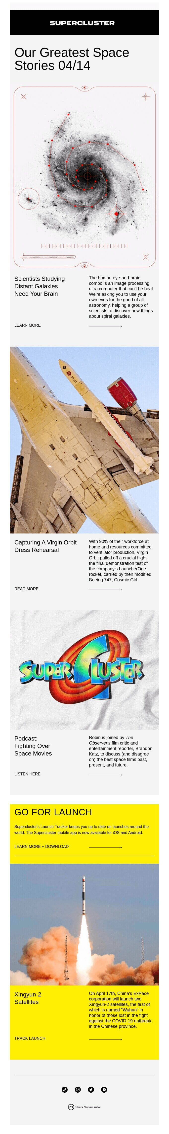
Example image source: Supercluster @reallygoodemails.com
‘Undesigned’ Plain Text Emails
Sometimes emails don’t need to be designed. Sometimes they need to look like a plain and simple email. This approach is especially useful for points in the sales cycle where the personal touch is more appreciated.
However, visual hierarchy principles still apply — namely using headers, bullet lists, white space and defined calls to action, to keep things organised. This will ensure that readers can easily scan and understand your message.
Minimalism vs Maximalism
Minimalist email design is a popular choice for brands that want to convey a sense of sophistication without distracting readers from the core message. But it’s not the only game in town. Improved graphic capabilities for smartphones and other devices have set the stage for a counter-trend — maximalism.
Capitalising on eye-catching effects, maximalist email design embraces busy layouts, dramatic fonts, colours, patterns, and shapes. It might be worth exploring for B2B brands who want to be viewed as fearless and creative. Which approach suits your brand best?
Bold Typography
Bigger and bolder typography is another email design trend for 2021. Evoking headlines of old, instead of a ‘hero image’ your email is designed around a ‘hero word’. Bold typography instantly creates a prominent statement, so choose your words carefully and pay attention to how the design works on different screen sizes. To avoid burying your readers under the words, also pay attention to whitespace and colouring around your headline.

Example image source: Adobe @ reallygoodemails.com
Pantone’s Colours of the Year
A good colour scheme plays an important part in email design – background, text, heading, graphics, hero area, CTA, etc. To keep your emails looking good, you’ll want to keep up with popular colour trends.
A good starting point is Pantone's ‘Colour of the Year’, which reflects colour trends across fashion, beauty, design and home décor industries. For 2021, Pantone actually picked two colours: ‘Ultimate Grey’ and ‘Illuminating’ yellow. Obviously, you don’t have to use either of these tones, but they can serve as a source of inspiration to keep your email design looking modish.

Example image source: Pantone.com
Muted Tones and Monochromes
Another popular colour trend for 2021, often used in combination with a sleek editorial design, is the use of muted palettes. Soothing pastel tones can soften a brand’s image and make it feel more approachable. You can also pick one colour to create an elegant monochrome layout. Dark backgrounds are another way email designers have been playing with colour.
Custom Imagery
If you've got the budget, ditch the stock and create custom brand photography for your brand. You’ll be free to let your imagination run wild and find creative ways to visually tell your story. For instance, high-quality 3D images that let your product speak for itself.
Unique imagery also helps build trust with your audience. It feels more ‘real’ (as in, it resonates with readers) and directly connects with and reinforces your message.
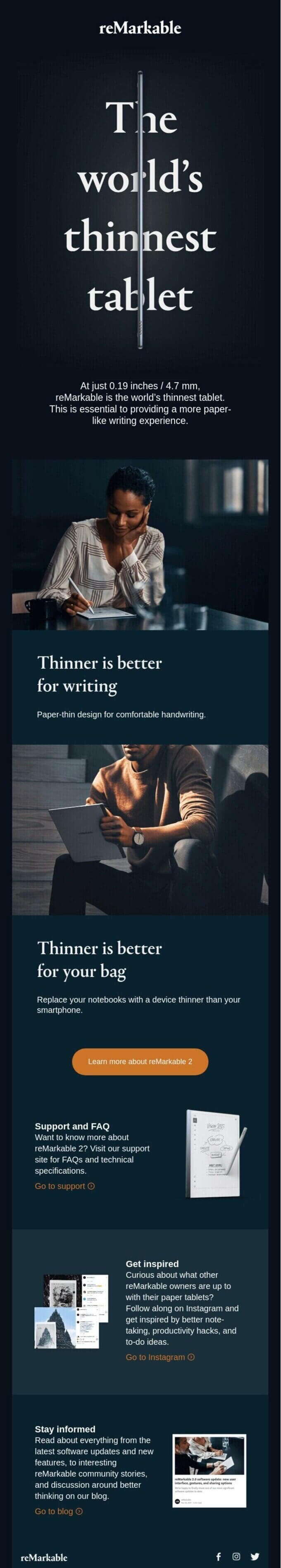
Example image source: reMarkable @ reallygoodemails.com
Illustration
In addition to unique photography, illustrations have been a big story in email design recently. Take illustrated iconography, for example, which can be a great visual aid for explaining brand features, actionable steps, etc. These lightweight graphics can help speed up page loading times while still conveying your brand personality.
Another option is to incorporate animated GIF illustrations in your email design. Doing so can bring your message to life and create a sense of purpose and action for the reader.
Animation Layering
Email visuals need to walk the line between looking great and loading quickly. One way to delight your viewer while maintaining a reasonable file size is through animation layering. In this approach, you layer an animation on top of other, static graphics. It provides a playful way to draw attention to certain elements and is particularly useful for adding additional depth to an image collage.
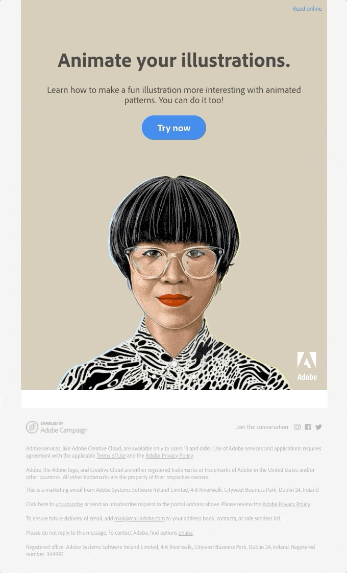
Example image source: Adobe @ reallygoodemails.com
Thinking About the Future
When talking about what's hot in email design, we would be remiss if we didn’t touch on the topic of AMP email.
The AMP (accelerated mobile page) email framework allows your messages to act more like a mini website or app. It allows recipients to do things like complete a purchase, book a reservation, or schedule a call — all from within the email itself. As you can imagine, this has the potential to transform email marketing strategy.
The technology isn't quite there yet, and it’s currently only supported by a few major email clients (Gmail, most notably). However, there’s a lot of interest and support, since when it works, it’s amazing. As such, we highly anticipate you should be looking at AMP email more closely within the next 6-9 months.
Your Email Marketing Partner
It can be challenging to stay up to date in the world of email marketing. Design trends, strategies and technology are constantly changing. Fortunately, you don’t have to do it alone. 1827 Marketing offers expert tools and services to help you create modern email campaigns that will delight your subscribers.
Contact us today to learn more!
ReallyGoodEmails.com is a terrific source of inspiration for campaign designs and trends. Many of the examples in this article were found on their site. We recommend check out their site regularly for other great ideas and example email designs. We don’t have any relationship with them, we just found their site useful and think that other B2B marketers will too.

Understand the significance of Gmail and Yahoo's updated sender requirements for B2B email marketing, and equip your organization with the knowledge and tools needed to navigate these changes effectively.