What do users want from your website?
It takes as little as a tenth of a second to start establishing key traits, such as trustworthiness. As soon as visitors enter your site, they have begun to form an opinion of your brand: before they have read a single blog post, product description, or even a headline .Answering the question of what someone looks for in a website is a critical part of building a successful site design.
Getting people to your website is only the first part of the battle as within the first 7 seconds, users form their first impression. Using SEO, PPC, and social media to drive people to your website only convinces people to click through. The next test is getting those visitors to stay long enough to engage with your site and sign up for a mailing list, or similar small conversion, so that you can proceed to nurture a relationship.
Most customers will only explore your website for less than 59 seconds .Your goal needs to be to exceed this average so that you can turn a visitor into a lead. A large part of this strategy lies in how you design your website and knowing what customers want to see when they land on your domain.
What makes a good website design?
1. Use design to invoke trustworthiness
Remember how incredibly quickly customers begin to form their first impressions. With this rapid judgment call, visitors do not have time to read about your brand or explore case studies. To influence their first impressions, you need to appeal to their emotions at first glance. Because the brain is primarily visual, you want to turn to photos and videos to help convey particular emotions, such as trust.
Sign up for our newsletter
Get the latest news and ideas from 1827 Marketing sent directly to your in-box.
You will receive an email from us every couple of months, and you can opt out at any time.
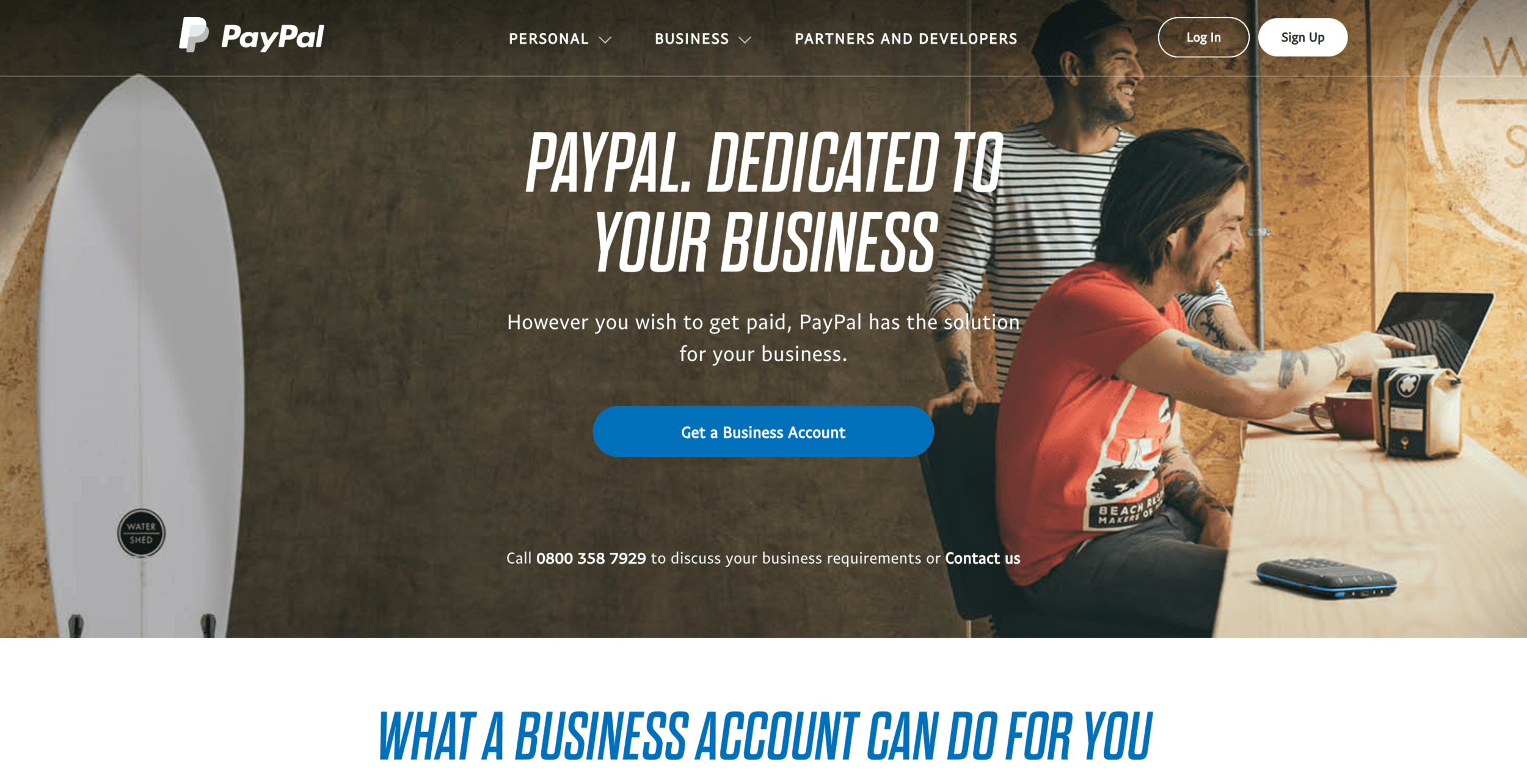
Ninety-four percent of first impressions are related to design. Consider a website overcrowded with blinking ads and Comic Sans font. On the other hand, consider the clean, efficient layout of a site like PayPal. Which conveys trust? Here the background image and simple messaging help customers relate to the benefits and convenience the service provides to themselves. Visitors can tell in a moment what this site can do for them, and the efficient design ensures that nothing distracts from the messaging.
Your website helps advertise your services, but it can also deliver your services

2. Provide clear information about who you are and how you can help
User experience remains critical to helping visitors form a favourable impression of your brand. When people land on your website, they are looking for specific information that will help them answer a question or fulfil a purpose they have in mind. Therefore, you need to make it as clear as possible how you can help these them.
Eighty-eight percent of customers are less likely to return to a website after a poor encounter. In other words, if you fail to provide a satisfying experience to new visitors, the chances are very high that you have lost them forever. Focusing on this experience from the moment the prospect lands on your page is a critical part of converting them in the future.
Don’t frustrate your users. Make it easy for them to see at a glance what your offer and the points of difference that make you the most suitable supplier to help with their issue. Showing them that you understand their struggles and using that information to encourage them to learn more about what you have to offer will create a favourable impression of your organisation.
3. Make it easy to navigate
When visitors land on your website, the first thing they do is orientate themselves to see how your site is organised. They want to know how to find the information that interests them first. That explains why half of your users will first look for a navigation bar. They want to see what else your site has to offer and the potential value it has for them.
Your navigation bar, therefore, should be easy to find and use and the placement and organisation of it should be intuitive. People who land on the site for the first time should not experience any confusion about where to click to find particular types of information.
Think about the different personas that might need your information. Depending on the unique needs of their business, they may want to see different types of products or services. The navigation and layout should make it clear how your services are relevant to potential customers from diverse backgrounds.
As you create your navigation options, also remember the different types of people who might and on your site. When people design websites, customers tend to be their sole focus. Customers, however, are not the only people who might need your site and can add value to your brand. Consider also the media, journalists, your staff, and prospective employees. All of these groups of people can offer value to your organisation. Make it easy for them to find information that appeals to them, as well. This increases the value your site provides to all the people who may need to visit your domain.
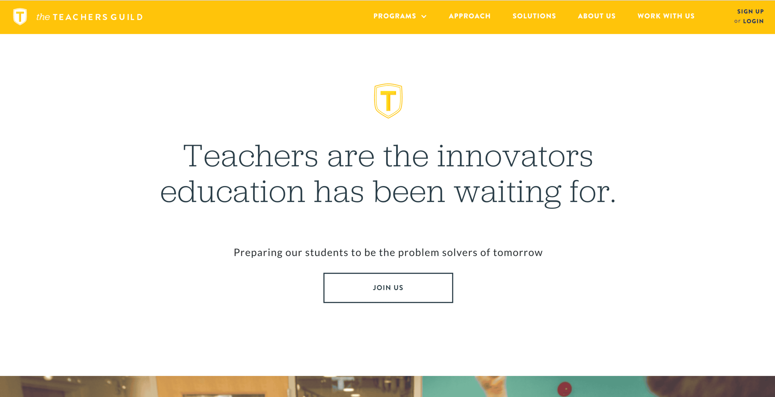
Look at examples of award-winning websites, like this Webby Award winner from The Teachers’ Guild. This website has crystal-clear navigation, a powerful and engaging taglines and emotion-evoking images below the fold.
Don’t make the online customer journey impossible to navigate.

4. Pay attention to site load speeds
Load time plays a critical role in site success, as both search engines and users pay close attention. Fifty-three percent of users report that they will leave a mobile site that takes more than 3 seconds to load. In other words, slowing down your site with excessive images, text, or ads can result in a large percentage of your potential customers clicking off without ever reading your content.
Broken images, slow-loading videos, and other features can all slow down your load speed and damage your users’ perception of professionalism and trust-worthiness. Of course, these visual features can play an essential role in engaging customers when they first land on the page, so your organisation will have to consider how to balance these competing needs. Look at your options and prioritise what to include on your landing pages.
Not only will customers click off, but Google also reportedly uses site load time as a ranking factor .In other words, if your site loads slowly, you may end up being penalised by Google and find your rankings lowered. Google does this because they understand users’ preferences for quick loading sites, and thus want to prioritise websites that provide a superior user experience.
5. Users expect mobile expertise
The online experience has made the shift from desktop browsing to mobile browsing, and customers expect brands to keep up. Fifty-seven percent of searches now take place on mobile with your visitors browsing sites and consuming content on the go. They use their phones on the train, at their work desk, and while walking around. If you are not prepared to engage with these mobile customers, your site will end up missing out on a large percentage of potential customers.
Eighty-five percent of customers report that they believe mobile experiences should meet or exceed desktop sites. They want your website to prioritise these mobile devices. Fifty-seven percent of customers say they will not recommend a site with a poorly-designed mobile experience. If you want those word-of-mouth recommendations, you have to make sure that your organisation is ready for mobile customers.
Once again, this factor not only impacts customer engagement but also search engine rankings. Google’s mobile-first algorithm examines the mobile version of websites first when ranking sites for search results. Failing to optimise correctly for mobile users will result in lower rankings and hurt your traffic.
6. Personalise the user’s experience
We are at the beginning of a personalisation revolution. Customers are increasingly catered to with personalised experiences, letting them know that organisations care about their individual needs.
The technology now exists for people to create websites that dynamically change for people based on demographics, such as their location or their behaviour on prior visits to the site.
A website that provides people with customised information based on the weather in their location or content suggestions based on what they have read in the past will do a better job of engaging customers. Modern consumers value these personalised suggestions. An estimated 49 percent of customers report buying something that they did not initially intend to purchase after they received an individualised recommendation from a brand.
Customers also have begun to expect personalised offers, with 62 percent reporting that they expect to see customised deals based on what they have already purchased from an organisation. Additionally, only 22 percent of customers report being satisfied with the level of personalisation they receive. In other words, brands have a long way to go in building personalised buying experiences that customers want to see.
Working with some marketing automation platforms makes this easier with drag-and-drop technology, allowing organisations to create dynamic web pages and returning users to see content tailored to them.
7. Make it easy to get in contact
When designing websites, brands also want to make sure it is easy for customers to reach out to them. Customers want it to be easy to reach out to the brand throughout the buyer’s journey. Sixty-four percent say that they want to see business contact information on the website when they arrive. If your contact information is hard to find, users will struggle to get in touch with you should any questions arise, and you will risk losing prospects.
8. Employ strong Calls to Action
You also want to make it easy for customers to know precisely what you want them to do. Your call to action (CTA) should guide them to the next steps to help them answer their needs. Every page should not have the same CTA: you want to tailor them to the likely circumstances that brought visitors to your page. Personalised CTAs convert an average of 202 percent better than generic ones. Therefore, take the time to craft CTAs that apply to your customers’ needs and that will appeal to them based on the circumstances bringing them to your website. You can use a variety of different types of CTAs, including inviting them to call your organisation, set up a meeting with representatives, view a demo, register for an email list, or make a purchase.
Clear and concise actions are a staple in content marketing and web design.

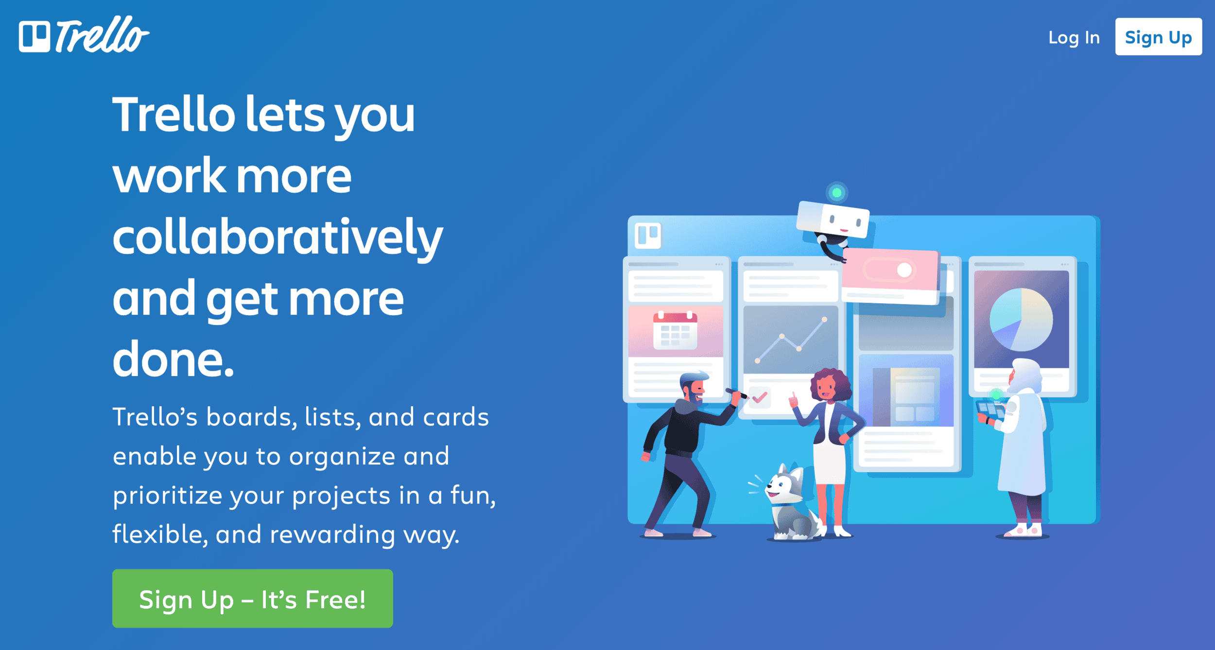
Consider the strong CTA on the Trello website. The green button stands out clearly against the blue background. The appeal of signing up is definite – registration is free, and you can help improve collaboration within your organisation. The user does not feel overwhelmed looking at this landing page but instead knows precisely what the website wants them to do.
9. Analyse, test and optimise for maximum effectiveness
As you design your site, you do not want to base it entirely on your instinct or even what worked well for other companies. Instead, you want to base it on what works best for your users. This requires regular testing your site to see what customers respond to best.
Several tools, including Google Optimise and Optimisely, exist that can help you test how one version of your site performs compared to another. Use these tools, along with data from Google Analytics, to see how you can improve your design, content promotion, and layout. As you test your site, you will gain a better idea of what your customers like to see helping you further streamline your results and achieve your best possible website.
The better you understand what your customers want to see, the easier it will be for you to create a website that appeals to them and brings them closer to conversion. Consider the various aspects of websites discussed above and see how you can incorporate or improve these elements on your site. Let your visitors experience design that has been created just for them.
Find out how 1827 Marketing can help
If you’d like to learn more about our software and services, use the button below to book a call. We’re always interested to hear about your B2B marketing objectives and to find out if we can help.
Have a B2B marketing project in mind?
We might be just what you’re looking for


